Web developers are continuously looking for designs that will attract and captivate visitors. Neumorphism as a web design trend was developed to give users a graphic interface that resembles the objects they use in real life. With this new web design trend, forms and credit cards appear on your site the way they appear in real life. So where did neumorphism come from?

The term neumorphism is derived from a combination of the words “New” and “Skeuomorphism.” Steve Jobs coined the word to describe the pioneering interface of the iPhone. Features designed with neumorphic elements included the iBook, the calculator, and the notepad app that resembled these items in real life. Google has also adopted neumorphic features in flat design with key items floating.
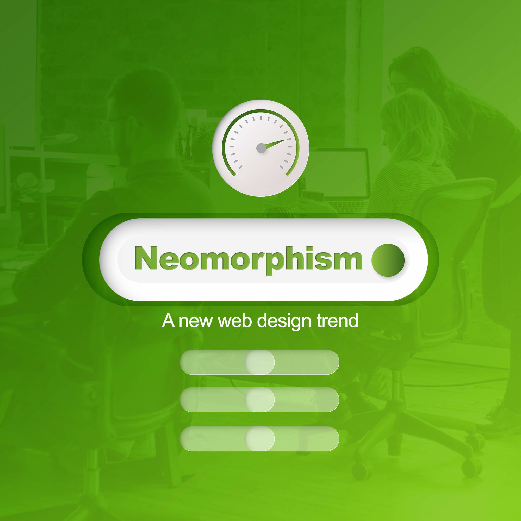
The Elements of Neumorphism
Designers using neumorphism aim at creating digital designs that resemble and function like the object they represent in real life. Apps designed in neumorphism have buttons that appear like they’re raised or pushed in. Well-designed neumorphic elements act like guides that show users how to operate the app. The features can tell users when to press a button, move to the next slide or switch interface.
Neumorphism is a type of minimalist web design. It doesn’t include many features. It mainly includes features with white interfaces and dark modes. You can still include colors that match your site and brand in neumorphism style.
Let’s look at some of the common visual elements associated with neumorphism.
- The use of light or soft colors in combination with the dark mode.
- Features in basic shapes like rectangles and circles.
- The inclusion of subtle shadows and effects with HTML and CSS.
- Having shadows around buttons and clickable elements.
Neumorphism as a web designed trend gained popularity in 2019. This trend is characterized by the use of simple colors with shadows to create depth. This leads to the creation of app features that almost look real without exaggerations. In spite of the attractive design, neumorphism is still a new web design trend. Designers are still experiencing technical difficulties working with this design. So proceed with caution.
Challenges with Neumorphism
The main challenge developers are having with neumorphism is accessibility and contrast. These two elements are related. Neumorphism uses soft colors with dark backgrounds most of the time. This limits access to all color pellets when designing the user interface. Designers are working on correcting this problem to continue the evolution of neumorphism. Some of the solutions to problems of accessibility and contrast include:
- Designing buttons with additional contrast and a realistic appearance.
- Don’t use too many shadows to make the neumorphic features more visible. Focus on designing text and click elements.
- Include different design effects for similar buttons performing different functions. Pressed buttons should appear sunken and un-pressed buttons raised.
- Keep the design features simple.
Now that you know the key elements of neumorphism, let’s tell you some practical applications of the design.
Streaming Apps
Web streaming apps designed with neumorphic features include elements like raised volume buttons, a video interface, and a background in soft colors. The buttons that control the video play also appear like they can be pressed just like in reality.
Dashboards
Dashboards with neumorphic features include a clear background with floating elements in different colors. Features like calendars, bookings, and reports are designed in neumorphism which gave them a realistic appearance.
Mobile Banking
Mobile banking apps designed in neumorphism have a clear background. Features like graphs and figures are designed using soft colors. Buttons that represent different elements also appear real and can be pressed.
Social Media Apps
In the social media space, Instagram has already included neumorphic elements in the Neo Instagram app. Users can add cool and real-looking backgrounds to their profile pictures. Elements like user names, posts, followers, contacts, and other key features are designed in soft colors. Navigation buttons appear like they’re floating and can be pressed.
Cryptocurrency Dashboards
Cryptocurrency dashboards designed in neumorphism appear futuristic. The dashboards are designed in dark soft colors. The app appears floating with function buttons that can be pressed. Figures, graphs, and corresponding elements are also designed in neumorphism and appear functional.
You’ve learned about Neumorphism and Its Elements. Should You Adopt It?
You should embrace the new UI/UX design if it provides value for your users. If you’re developing a mobile app for the elderly, it’s beneficial to adopt a neumorphic design. It makes it easy because the design results in realistic icons that are easier to find and use. So, before joining the bandwagon, it’s important to ask yourself whether your users need a redesign.
Remember, neumorphism is relatively new and developers are still facing challenges with it. The problem with the new UI/UX design is that you can only use dull colors and with limited elements. Neumorphism is expected to grow in popularity in the future as more tech companies adopt the trend.